


COVER REVEAL: The Jackfruit Chronicles
she is here and she is gorgeous

Hello friends,
I’m beyond excited to finally be able to share this with you!
Introducing the front cover design for The Jackfruit Chronicles: Memories and Recipes from a British-Bangladeshi Kitchen:
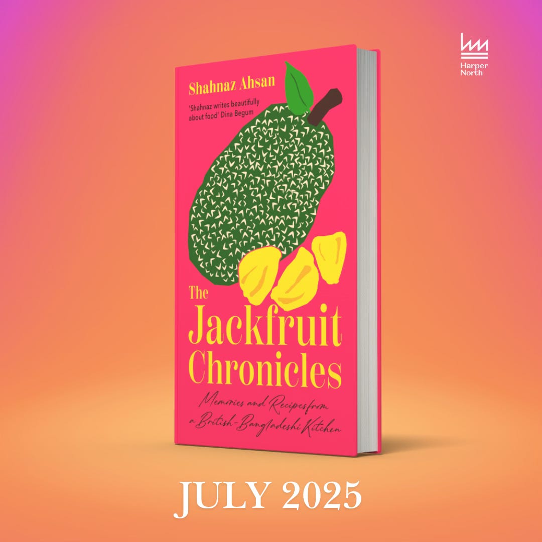
Look. at. her.
This is the cover for the proof copies (early copies that go out to people in the industry for review) and will also be the cover for the hardback edition. The paperback will likely be a whole new design - which I’m already getting excited about!
How does a book cover get designed?
I often get asked how much input I, as the author, get in designing the book cover - the answer is that it depends on both your publisher and you. I feel so lucky that the team at HarperNorth were really receptive to my ideas and we worked hard together to produce this beauty - so let me share a little behind the scenes detail about the process:
Step 1: I worked with my editor on putting together a moodboard of other title covers that I loved. I knew I wanted something colourful, beautiful, and evocative. Because this is both memoir and food, we wanted something that spoke to both - so our early ideas included maps (to denote migration and movement) and illustrations (I was especially keen on this), and we agreed to avoid photography. We both agreed that with ‘jackfruit’ being central to the title (and the book) - and it being an unfamiliar fruit for many readers, we wanted the image to feature on the cover.


Step 2: The designer worked with our ideas to mock up 3 or 4 different options - these were initially quite text heavy and not as eye-catching as we envisioned. It’s hard not to feel disheartened at this point because, let’s face it, we ALL judge books by their covers. But we realised that there were too many ideas thrown into the brief at once, so we pared it down: for example, one theme that we ultimately decided against, was having Bangla script on the cover and some traditional Bengali motifs like the shapla or waterlily. Instead we focused on illustration, font, and colour.
Step 3: I took a step back here and let editor and designer, along with input from the sales and marketing team, hash out the next set of designs. I learnt that from a sales perspective, the most important thing for a hardback edition is to be identifiable: you want the book to jump off the shelf. So the priority is to be striking, bold, eye-catching. The team arrived at a version that seemed to fit the bill: a jackfruit illustration, with a bold title font, and a vibrant orange background. This was shared with me and I was delighted (and relieved!) that we were definitely moving in the right direction.
Step 4: This was where I was able to feed in a bit more about my vision: I really wanted a handwritten script to feature somewhere on the cover: to me, it spoke to the memoir element of the book, and also I loved the callback to the paperback cover of Hashim & Family which features a handwritten font too. The other big change was the background colour: I asked if we could switch from the rich orange and black font to a bold magenta with a yellow title font - and happily the marketing and sales team at HarperNorth gave it the go ahead! We also tweaked the illustration to show both the unique exterior of a jackfruit, as well as examples of what the edible segments look like. Some final decisions on the fonts and placement - and a lovely quote from the fantastic Dina Begum (author of Made in Bangladesh) and here we are!
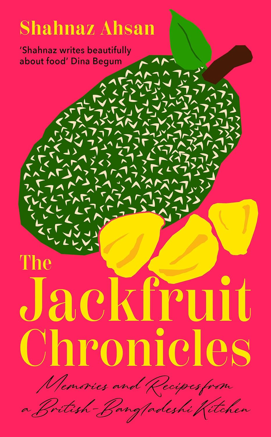
I can’t wait for you to be able to get your hands on The Jackfruit Chronicles. It is available for early pre-order from all bookshops now as well as the website UK Bookshop which supports independent stores and Amazon.
Thanks for being with me on the journey,
Shahnaz x